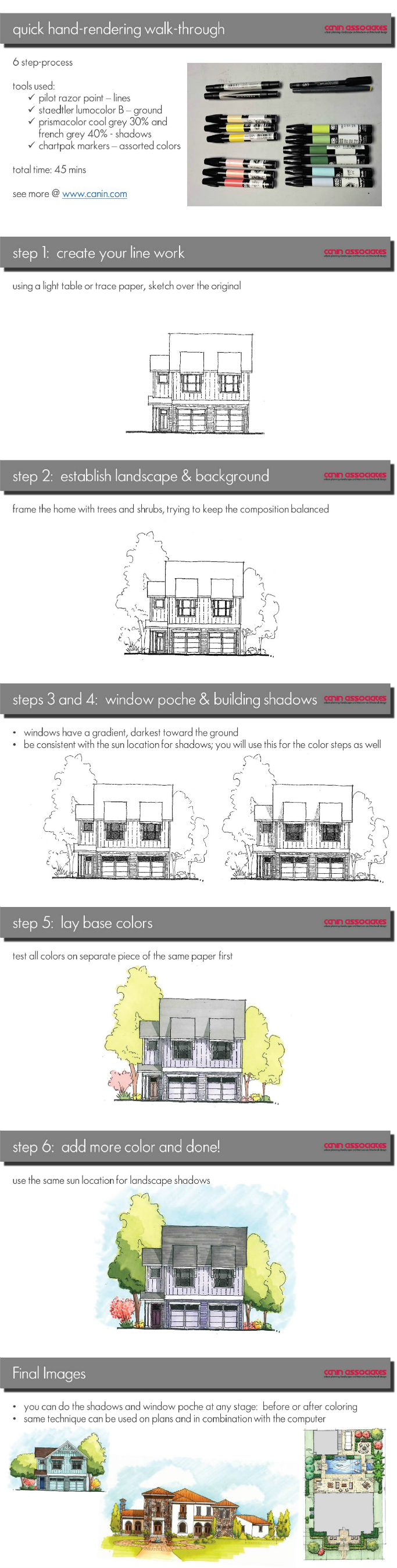
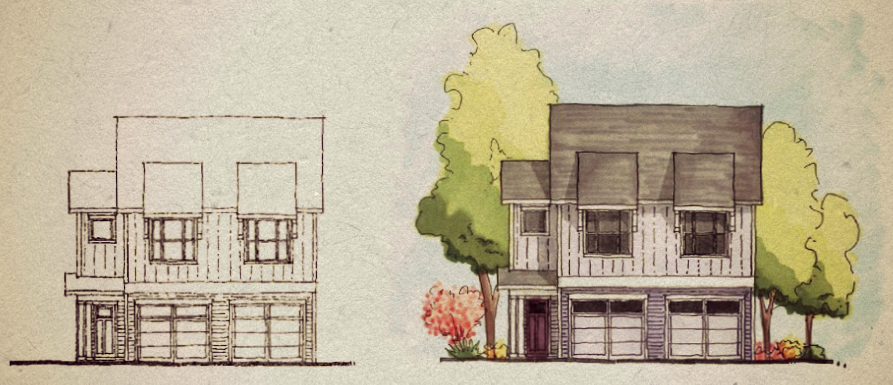
Canin How-To: A Quick Hand-Colored Elevation
A quick marketing image can be created and used at any stage of the design process. An architectural rendering can assist in giving the client an understanding of the building or concepts of the design that can only be explained in shadow and/or color. By creating the image by hand, the client can visualize the project and add comments without feeling locked in to a photo-realistic computer-generated image.
Creating a hand-drawn elevation is a great way to flex those design muscles that may be a little rusty and to create a unique stamp for your personal and company brands. Below, you’ll find our six easy steps to go from blank paper to colored rendering, which we also collected in an infographic.
Tools used:
- Pilot razor point pen (linework)
- Staedtler lumocolor B (heavy ground line)
- Prismacolor Cool Grey 30% and French Grey 40% (shadows and window poche)
- Chartpak assorted colors
- Total time: 30-45 minutes
Step 1: Creating Your Linework
Using a light table or trace paper, sketch a new elevation. A single line weight is fine for this style of rendering. If you want a more detailed or realistic quality use multiple line weights. Depending on the scale and desired level of detail, do not overdo the details and material renderings. A heavy ground line gives the images a strong base since it will not be framed
Step 2: Establish Landscape and Context
For this image, trees and shrubs will give the home context. Aim for balance and by paying attention to the overall composition. Again, do not lose yourself in drawing every leaf or branch; go for outlines and texture, the detail can be added later or with color
Step 3: Window Poche and Step 4: Building Shadows
Windows when viewed in sunlight are actually relatively dark. However, you can add dimension to your window poche (the filling in of windows) by creating a soft gradient from darkest at the bottom. For shadows, establish your sun location and angle. This will also give you your shadows for when you add color. A simple trick is to place the shadow on the artist’s dominant side: for righties, the shadows are on the right and bottom, for lefties on the left and bottom.
Step 5: Base Color
Test all colors on a separate sheet of the same paper. This way you know exactly how it will show up and can juxtapose the color variations quickly without having to lay a lot of color down on the image. Start with one flat base layer of color. As a rule of thumb, have two or three hues per piece, for example three greens for the trees, three pinks/reds for the shrubs, and so on. For a smoother transition of color, you can add a second layer of the same color before changing to a different marker.
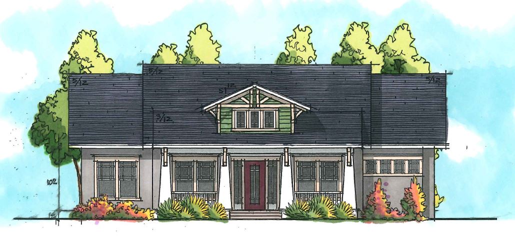
Step 6: Add more color and you’re finished!
Use the same sun location you established when you did the building shadows in grey for your colors. This will keep the image consistent and still give an air of realism. Frame the building with a soft sky color, fading from darkest at the horizon line.
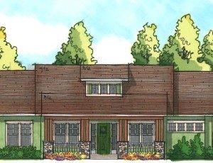
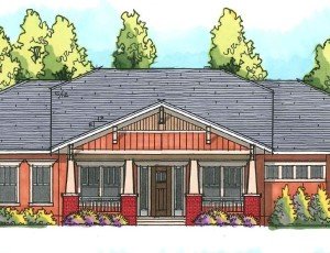
If you want, the shadows and window poche can be added after coloring, since the markers act like watercolors and allow a multiplying effect. Feel free to combine a hand-rendering technique with computer software for a more crisp that still has a lot of personality. This style can be used on any 2D image, plan, or elevation, as well as for 3D perspective views. It’s quick and simple, but still creates a great marketing image and branding style for you or your architectural office.